Pastel Blue Color Palette Inspiration with Hex Codes
Plus, (almost) everything you wanted to know about the color pastel blue
Pastel blue color palettes are dreamy. They’re pretty to look at and can be incorporated into most any digital project! So let’s learn a little more about the color blue, and the qualities that turn it into a pastel.
The color blue and its meaning
The color blue strikes a sense of trust, dependability, and stability. It’s widely used by certain industries, such as finance, for instance. Take a moment to think about all the institutions that use this color in their logo. Chase Bank, PayPal, and American Express all incorporate a version of blue in their logo. But blue isn’t limited to banks, or even financial organizations for that matter. Blue is seen in other industries as a way to convey serenity. This color has a calming effect, and is often associated with elements related to nature, like the sky or the planet. Well-known brands, such as Salesforce, AT&T and Skype take advantage of this association, and use organic, recognizable shapes in their logos too.
What defines a light blue pastel color?
Pastel blue has 3 qualities to it. These characteristics apply to all pastel colors in general, so take note if you’re obsessed with pastel colors like we are!
Tints. First, a pastel blue color is created by adding white to any blue. Simple as that! So what’s the difference between light blue and pastel blue? Pastel blue is more muted, and not nearly as bright as a baby blue, for example.
Value. Pastels have a high value, which means that they are they are lighter in color. A color’s value is its lightness or darkness. In other words, its value determines whether it’s closer to white or black.
Saturation. Pastel blues have a low to medium saturation. Saturation is the purity of a color. So, if a color is less saturated, that means it’s less intense.
How to use pastel blue
A pastel blue color palette has a calming effect which makes it easy to incorporate into any digital project. Pastel blues make a perfect background color. Rather than using grey, for instance, use one of these light blue pastel color instead. These soft blues are inviting and relaxing. What makes pastel blue so wonderful is its versatility. It can be matched with other hues without competing for attention. For instance, you can pair it with other soft neutral colors, like beige or cream, to make a design feel modern and elegant. Or, match it up with a coral or gold color. It can be the star or supporting color in just about any design!
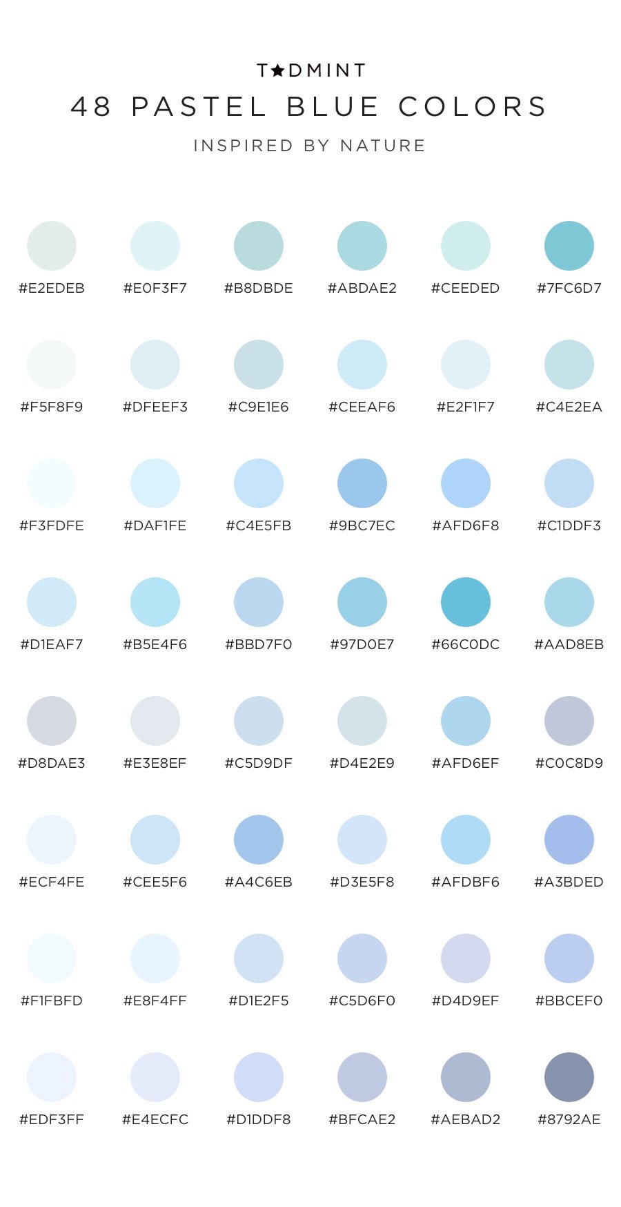
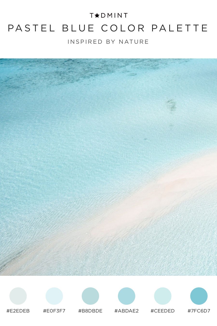
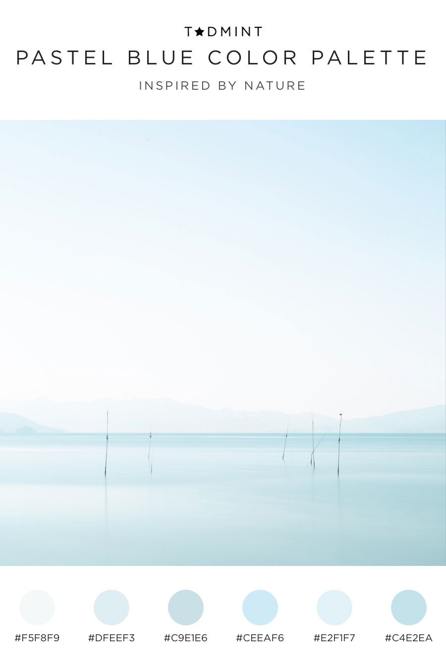
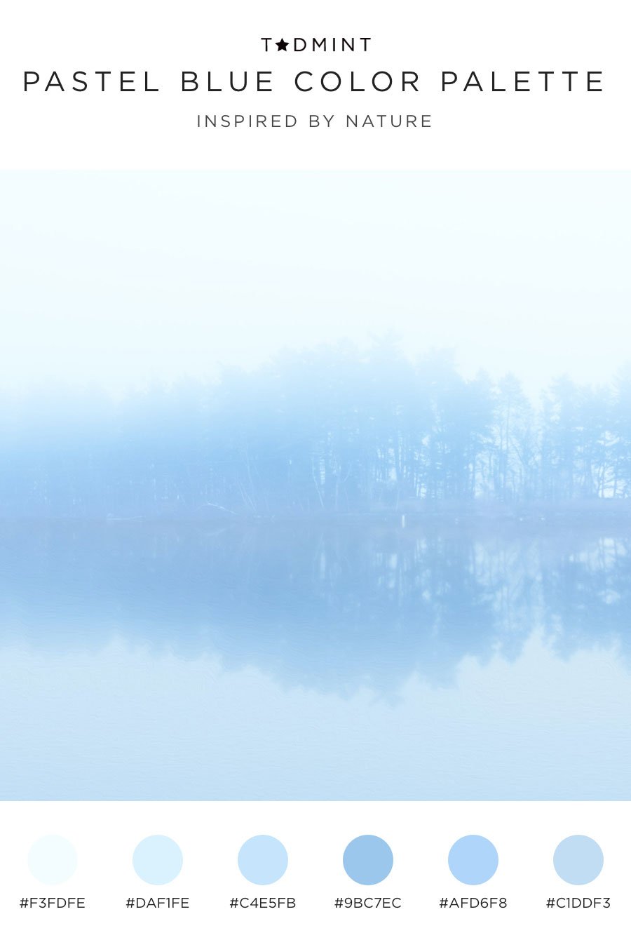
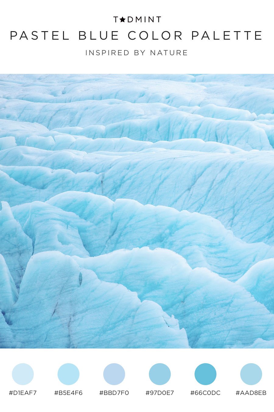
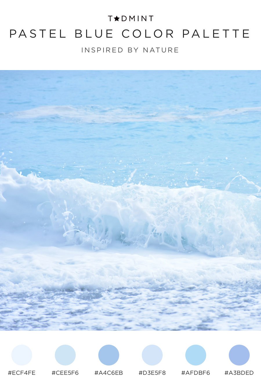
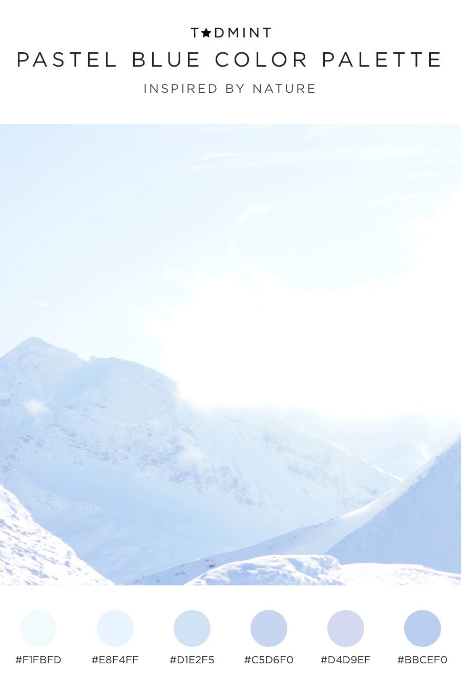
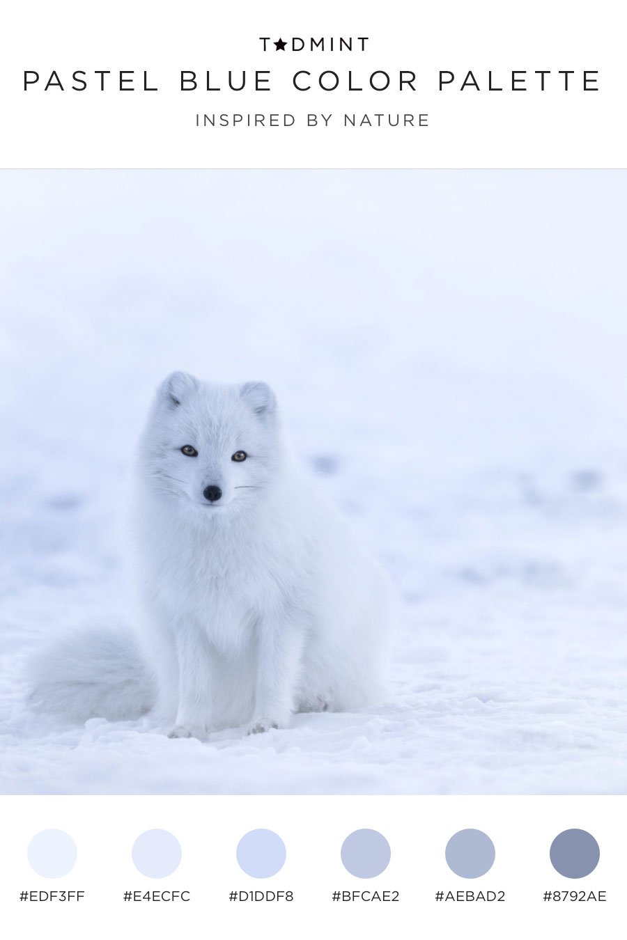
Pastel blue color palettes with hex codes
Without further ado, here are 8 pastel blue color palettes to inspire your next creative project. We included the hex codes in each to make it easy for you.
And in case you’d like to use these later, save our pastel blue color palettes with hex codes now. Let us know how you’ve implemented these pastels! We’d love to see your work.